American Gothic
Chaos, Anachronism and Modernity in Eyvind Earle’s Sleeping Beauty
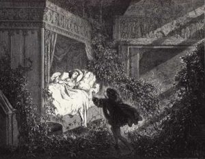
Gustave Doré, Illustration for Charles Perrault’s La Belle au Bois Dormant in Les Contes de Perrault, 1867
The philosopher of anachronism, Jeremy Tambling, has argued that what is ‘postponed’ appears as anachronistic. Drawing a metaphor from the world of modern travel, he writes that jet-lag (décalage horaire or ‘time-gap’ in French), ‘places one time (that of the body) inside another [time], literally postpones it’ (Tambling, 2010: 16). The Beauty in Charles Perrault’s famous story for children, published in 1697—The first of its kind to be called La Belle au Bois Dormant (‘The Sleeping Beauty in the Wood’) —, is herself an anachronism, a body ‘postponed’—a figure from the ancient past recalled to life. And the Prince, who helps her to rise, is struck with embarrassment. For though she is fully dressed (and quite magnificently), she is dressed just like his great-grandmother – in the fashion of a century before – and wears a ‘point-band’ peeping over her collar (Perrault, 1992: 89).
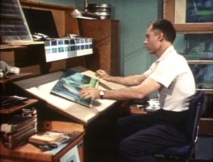
Eyvind Earle working on the backgrounds for Sleeping Beauty (still from Four Artists Paint One Tree, Disney television documentary, 1958)
The great disappointment of the Disney film is the absence from the narrative of this time-convulsive aspect. The lovers are acquainted in this version prior to the inception of the evil curse that puts Aurora (the Sleeping Beauty) to sleep; and the hero rides to the rescue much more promptly than his textual counterpart (of whom the Beauty was justified in complaining, ‘is it you my Prince?… you have waited a great while’) (Perrault, 1992: 88). Though the idea of time lost and the idea of time regained are absent from the film story, the feeling of time-displaced is present by visual inference. Indeed, for contemporary viewers, schooled in the retro chic of Madmen, the fifties graphics scream as loud as all the gothic accoutrements. The look of the film was largely the responsibility of Eyvind Earle, an illustrator who had worked as a greetings-card designer in New York prior to joining Disney’s staff as a background painter in 1951.
In his role as ‘colour stylist’, Earle single-handedly produced hundreds of pre-production concept paintings for the film, using gouache and sometimes water-colour or pastel, and later authored many of the elaborate production backgrounds used in the finished film. Many of his colleagues felt oppressed by his creative dominance, but Disney wanted Earle’s highly distinctive painting style to serve as a model for all aspects of the film’s design, and the characters were drawn in a hard-edged attenuated manner to blend with these settings.
Disney’s somewhat over-zealous regard for Earle’s decoratively-modern graphic form can be understood as symptomatic of his own vexed relationship with the modernity of animation. Since the beginning of his career Disney had alternated between a superficial embrace and an anxious repudiation of abstract or reductionist modernist aesthetics. He saw himself above all as beholden to the mainstream artistic tastes of his ‘public’ and had earlier invoked ‘the constitutional privilege of every American to become cultured’ or, as he put it, ‘to just grow up like Donald Duck’ as they chose (qtd. Watts, 1995: 102). Beneath this prima-facie democratising ethos there lurked a pernicious anti-intellectualism, a hostile resistance of the challenge to accepted values posed by radical formal experimentation. As Disney confessed to a magazine journalist some months before his death: ‘I’ve always had a nightmare. I dream that one of my pictures has ended up in an art theatre. And I wake up shaking’ (qtd. Schickel, 1997: 189).
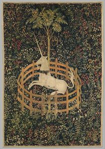
The Unicorn in Captivity (from the Unicorn Tapestries), 1495–1505, wool/ silk tapestry, 368 x 251.5 cm), Metropolitan Museum of Art
Disney’s aesthetic career is thus apt to be conceived in terms of a struggle against modernism; a struggle to repress the primitivist vitality inherent in his own medium. The struggle succeeds of course, to the extent that Richard Schickel, writing in 1968, was able to proclaim Disney’s legacy a masterpiece of capitalism not of art. But the precise appearance of that struggle changes according to developments in public taste and shifting perceptions of ‘the modern’ in American design culture. By the 1950s, ‘modernism’ as a style had been widely accepted and commodified. The mid-century vogue, driven by the post-war consumer boom and by advances in materials and fabrication technology, by the increased influence of design reformists, and by a collective desire (in the aftermath of the Second World War) to reject the past in favour of a utopian futurism, was heterogeneous in its look and philosophy. It might incorporate such wide-ranging aspects as the return to handcraftsmanship, the geometric machine-style, or the organic/ biomorphous silhouette. Linking these diverse permutations of the ‘new’ was a prevailing aspiration to liberate design aesthetics from the stagnating influence of the previous century. As the editors of Interiors magazine proclaimed in 1948: “We do not approve […] of a Georgian dining room, no matter how beautifully reproduced, on the 32nd floor of a skyscraper hotel” (qtd. Marcus, 1998: 7).
The makers of commercial animated films would be quick to take advantage of the modern sensibility infecting all areas of the graphic and applied arts. But the need to keep pace with contemporary fashion jarred with the Disney studio’s commitment to nostalgia (the retro-fetish of the Disney brand). For Sleeping Beauty (1959), Earle conducted research into fourteenth- and fifteenth-century European tapestries, paintings and illuminated manuscripts, drawing on a wide range of early-Renaissance and primitive-gothic sources—Dürer, Bruegel, Van Eyck, Botticelli, the Trés Riches Heures du Jean Duc Du Berry, The Unicorn and Multiflower Tapestries as well as Persian miniatures and Japanese prints.
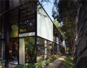
Charles and Ray Eames, Case Study House 8: The Eames House, 1949
But why Medieval? Perrault seems to have imagined the story taking place in a world parallel to his own (the text is full of references to the baroque French culture of his day), and many illustrators since have favoured a late-mannerist or Rococo setting. The story came under pre-Raphaelite influence, for example in Edward Burne-Jones’s celebrated murals made for Buscot Park in Oxfordshire between 1870 and 1890. Earle’s concept for the film is, then, doubly anachronistic—and borrows heavily from the earlier retrospective tradition. But his interest in the gothic style went far beyond the nineteenth-century medievalist paradigm with its truth-to-nature ideals. John Hench, another artist who worked on the film, thought the pre-renaissance works with their lack of spatial depth and modelling would translate well into animated cartoons. As Hench put it, the images in fifteenth-century tapestries ‘have crisp edges,’ and the planes are scarcely defined, ‘except by a kind of superimposition for distance rather than linear perspective’ (qtd. Barrier, 1999: 557). There is an implication then that Earle arrives at modern pictorial form partly by imitating the medieval style.
Earl himself acknowledged the modern aspect through his avowed preference for strong verticals, horizontals and angles as opposed to curves. This was a quality he attributed—first and foremost—to what he called the ‘primitive technique’ of his gothic forbears. ‘The Trees are squared, and everything else carries out the horizontal pattern,’ he observed. (qtd. Thomas, 1991: 105). But this angular style is also a feature of modernity and lends to the background paintings (and to the animation) an aspect of the ‘machine’ aesthetic favoured by mid-century design. Earle’s totalising command of the picture-space appears compulsive, even neurotic in its visual manifestations—its’ excess of stylisation—especially in the woodland settings where grass verges and foliage are squeezed into implausibly sharp prismatic or rectilinear masses. This effect reverses the histrionic conceits of Art Nouveau, where flowing contours of moving liquids or plant-forms are deployed to animate and fetishise industrial materials. In Earle’s designs for Sleeping Beauty, the hard-edged contours of industrially-manufactured objects are displaced onto nature itself. This formal stricture is apt symbolically; bold right-angles in the drawing serve to visually enhance the film’s thematic preoccupation with sleeping, waking and death. And this semiotic arrangement is crassly gendered in the film’s notorious climax when (vertical) masculine efficacy and (horizontal) feminine insensibility are starkly counterpoised.
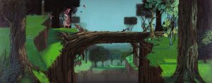
Sleeping Beauty, 1959, dir. Clyde Geronimi, Disney (film still)
But – to return to the theme of anachronism – here we have an instance of temporal disorder that reverses the usual account of the term. Earle’s simulation of history is not flawed by some irregular detail (like the clock in Julius Caesar) but fated to impurity because the image of the past so closely resembles the design of the present—the medieval tapestries already look like mid-century-modern cartoons (as the Disney artists were quick to recognise). The second great disappointment of the film is Earle’s apparent loss of nerve with regard to this formal and temporal paradox. For all his modern (and his medievalist) tendencies, Earle could not resist the urge to simulate nature, and the animators, trapped by Disney’s inexorable taste for realism, followed suit with their virtuoso renderings of the human figure in motion. In the finished film the two contradictory pictorial modes—the gothic and the ‘realistic’—operate in fragile synthesis; indeed the effects are quite abstract, bordering on the surreal, whenever they inter-merge. Aurora’s curls, drawn by animator Marc Davis as whorled-icons of coiffed fashion model’s hair, never pass for the real thing; even when seeming to attain three-dimensional volume; are never more than a sign made plastic, at once gelatinous, fluffy and hard. (Again we could look to the mid-century modern for a tactile equivalent to this image – and we would find it in the abstract biomorphism of post-war ceramics and glass).
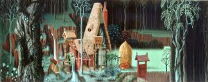
Eyvind Earle Sleeping Beauty (the fairies’ house in the forest, preliminary study) c.1949, gouache Burbank, California, Walt Disney Feature Animation and the Animation Research Library
The literary-critic Joseph Luzzi has recently proposed that certain examples of anachronism in fiction can collapse the boundaries between the work’s ‘internal means of reference’ and its external (historical) context (Luzzi, 2013: 70). Applying a similar thesis to the medium of animated film, we might ask: what is the meaning of this collapse when modernism has been accepted as the aesthetic and cultural norm? The mid-century modern was itself a genre structured by anachronism, by décalage horaire, and by time lagging behind, since it brought to late-flower the ideas and practices of an earlier more radical aesthetic phase. Post-war design culture was heavily informed by the European experiments of the previous decades, by the Bauhaus and International Style in architecture, by Matisse’s elaboration of the picture-space, by Surrealist painting and sculpture. In other words, the ‘new’ aesthetic relied on forms and ideas that were already ‘historic’ when they came to popular fruition; novelty lay with the inventive pastiche and juxtaposition of these diverse avant-gardes and in the exaggeration of their forms for ornamental and rhetorical effect. In the process, the visionary-socialist principles of modernism were diluted and detoured. Contrary to the progression design theories of Adolph Loos or le Corbusier, in which ornament had been rejected for its hysterical irrationalism, its debased bourgeois character and lack of hygiene, the expansionist logic of post-war capitalism required that products be sought in abundance, that form should consequently exceed function, and that the acquisitive ideal should manifest itself as a raging superfluity of things and images.
The mid-century modern is thus closer in spirit to the heterogeneous, accumulative model of post-war consumerism than it is to the philosophy of pre-war Bauhaus. The cluttered ambience of the mid-century style can be read retrospectively as a scene of disorder and impermanence, of temporal confusion and aesthetic and ideological uncertainty. Post-war culture ‘was fraught with anxiety’ as the architecture historian Robin Schuldenfrei has argued, whether occasioned by the ‘accelerated, if partial, liberalisation of social mores’, or the shadow of the Cold War and the ever-present nuclear threat (Schuldenfrei, 2012: xi).
In addressing these protean matters of taste and form to Sleeping Beauty’s morbidly conservative rhetoric of gender, we might ask to what extent these contradictions are resolved in the apparent triumph of rationalist order over a seductive ‘chaos’ of pastiche. Certainly the idea of chaos in the film (implicitly gendered as female and embodied in the spectacle of forests, flames, hair, thorny tendrils, glowing particles of dust and other super-natural phenomena) is itself the subject of rigorous ornamental principles (of distortion, pattern, angularity, symmetry and repetition). As Luzzi would argue the ‘rhetoric of anachronism’ resists ‘isolation or separation’ from the historical discourse in which it participates, and neither Earle nor Disney could help but be subject to the anxieties of their time (Luzzi, 2013: 70-1). Indeed, it is during her final transformation into a dragon, that the evil fairy, Maleficent, unleashes one of the film’s most potent and sinister anachronisms; in Earle’s sketch of this episode and in its final version on screen, the conflagrations that briefly surround her resemble an atomic cloud.
THIS PAPER WAS DELIVERED AT THE PCA/ACA NATIONAL CONFERENCE, NEW ORLEANS, 3rd April, 2015.
REFERENCES AND FURTHER READING
Barrier, Michael J. Hollywood Cartoons: American Animation in Its Golden Age. Oxford; New York: Oxford University Press, 1999.
Coyne Kelley, Kathleen. ‘Disney’s Medievalized Ecologies in Snow White and the Seven Dwarfs and Sleeping Beauty’. in The Disney Middle Ages: A Fairy-Tale and Fantasy Past, Tison Pugh ed. New York; Basingstoke, Hampshire: Palgrave Macmillan, 2012: 189-209.
Gid Powers, Richard, ‘The Cold War in the Rockies: American Ideology and the Air Force Academy Design’. Art Journal, vol. 33, No.4 (Summer, 1974): pp. 304 – 313.
Jackson, Lesley. The New Look: Design in the Fifties. Manchester; London; Barcelona: Thames and Hudson; Manchester City Art Galleries, 1991.
Luzzi, Joseph. ‘The Rhetoric of Anachronism.’ Comparative Literature, 61:1 (2009): pp. 69-84.
Marcus, George H. Design in the Fifties: When Everyone Went Modern. Munich; New York: Prestel, 1998.
Nagel, Alexander. Medieval Modern. Art Out of Time. London: Thames and Hudson, 2012.
Perrault, Charles. ‘The Sleeping Beauty in the Wood’ (1697). Robert Samber trans. in Opie, Iona and Peter, The Classic Fairy Tales. 2nd ed. New York: Oxford University Press, 1992: 85-93.
Schickel, Richard. The Disney Version: The Life, Art and Commerce of Walt Disney. 3rd ed. Chicago, Ivan R. Dee, 1997.
Schuldenfrei, Robin. Introduction to Atomic Dwelling: anxiety, domesticity, and postwar architecture. ed. Robin Schildenfrei. London; New York: Routledge, 2012. xi- xiv.
Tambling, Jeremy. On Anachronism. New York; Manchester: Palgrave; Manchester University Press, 2010.
Thomas, Bob. Disney’s Art of Animation: From Mickey Mouse to Beauty and the Beast. New York: Hyperion, 1991.
Watts, Steven, ‘Walt Disney: Art and Politics in the American Century’, The Journal of American History, Vol. 82, No.1, (June 1995): 84-110.
